Background
Chef is a magazine and educational platform for managers. In 2021, they merged with Chefakademin and Mgruppen and required a new platform to consolidate their operations. Mgruppen and Chefakademin had previously organized and conducted various training courses for managers, while Chef had been a magazine catering to the same audience. Under the new Chef.se, they brought together their combined expertise under one roof, featuring a new visual profile and layout.
My role
UX/UI Designer
First blurb experience
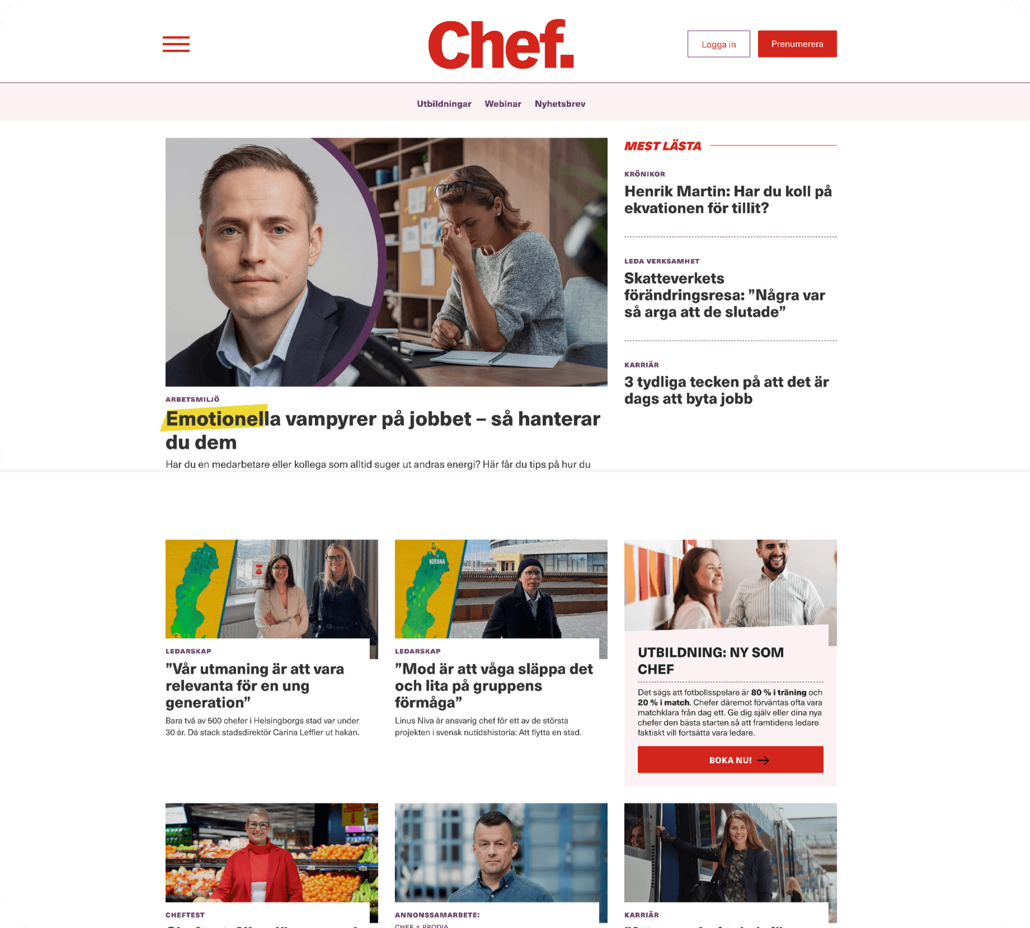
This was my first experience designing for a magazine. I focused heavily on ensuring users could easily differentiate between various “blurbs” and understand the type of content they were opening. However, I aimed to avoid clutter by limiting the number of variations, striking a balance between clarity and simplicity.




Different forms of articles
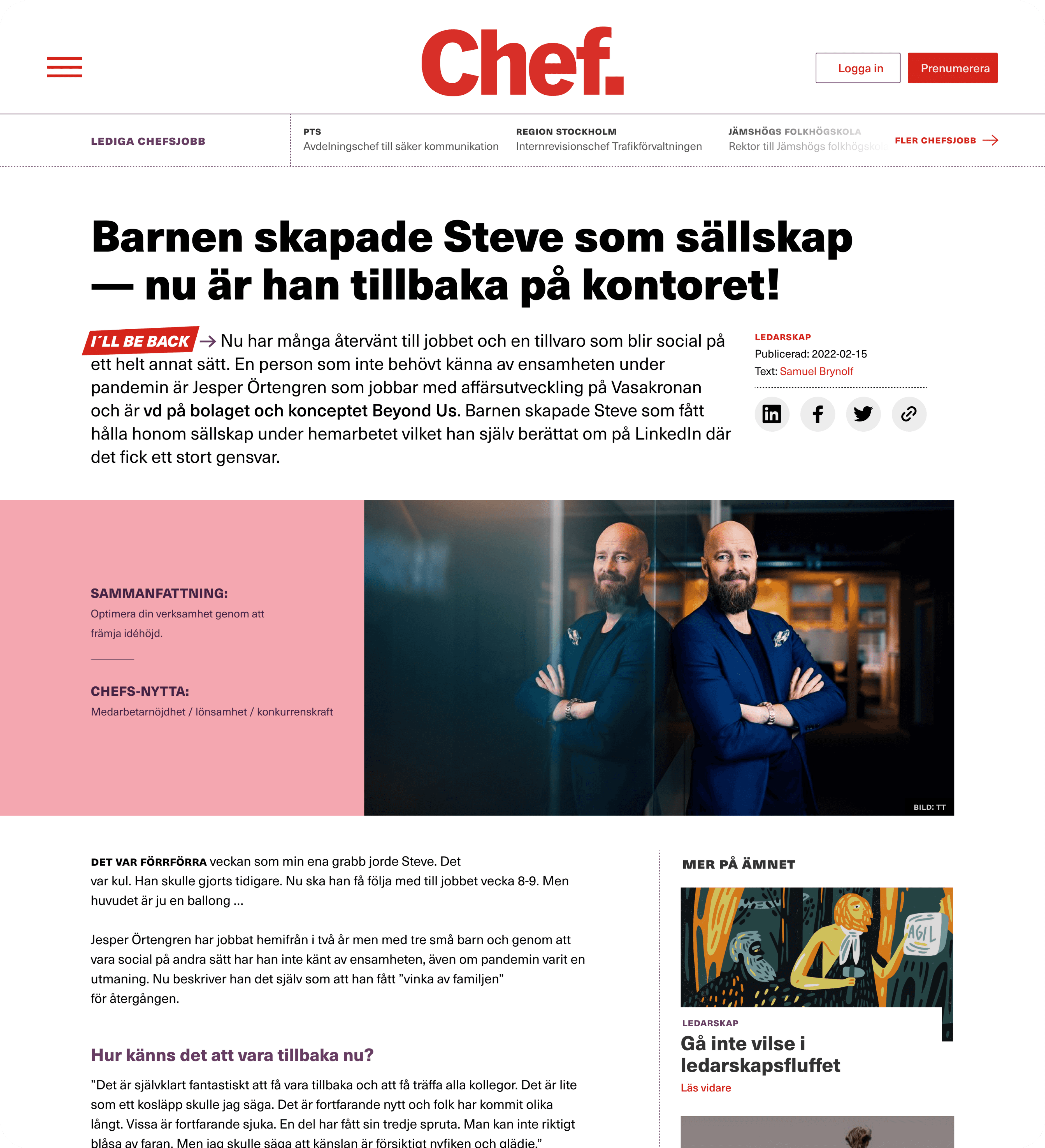
I continued my process from designing the blurbs into the creation of the articles. My goal was to ensure that the articles visually reflected the different blurbs and content types, so users could easily recognize the category of content they were about to engage with.
Different forms of articles
I continued my process from designing the blurbs into the creation of the articles. My goal was to ensure that the articles visually reflected the different blurbs and content types, so users could easily recognize the category of content they were about to engage with.
Different forms of articles
I continued my process from designing the blurbs into the creation of the articles. My goal was to ensure that the articles visually reflected the different blurbs and content types, so users could easily recognize the category of content they were about to engage with.


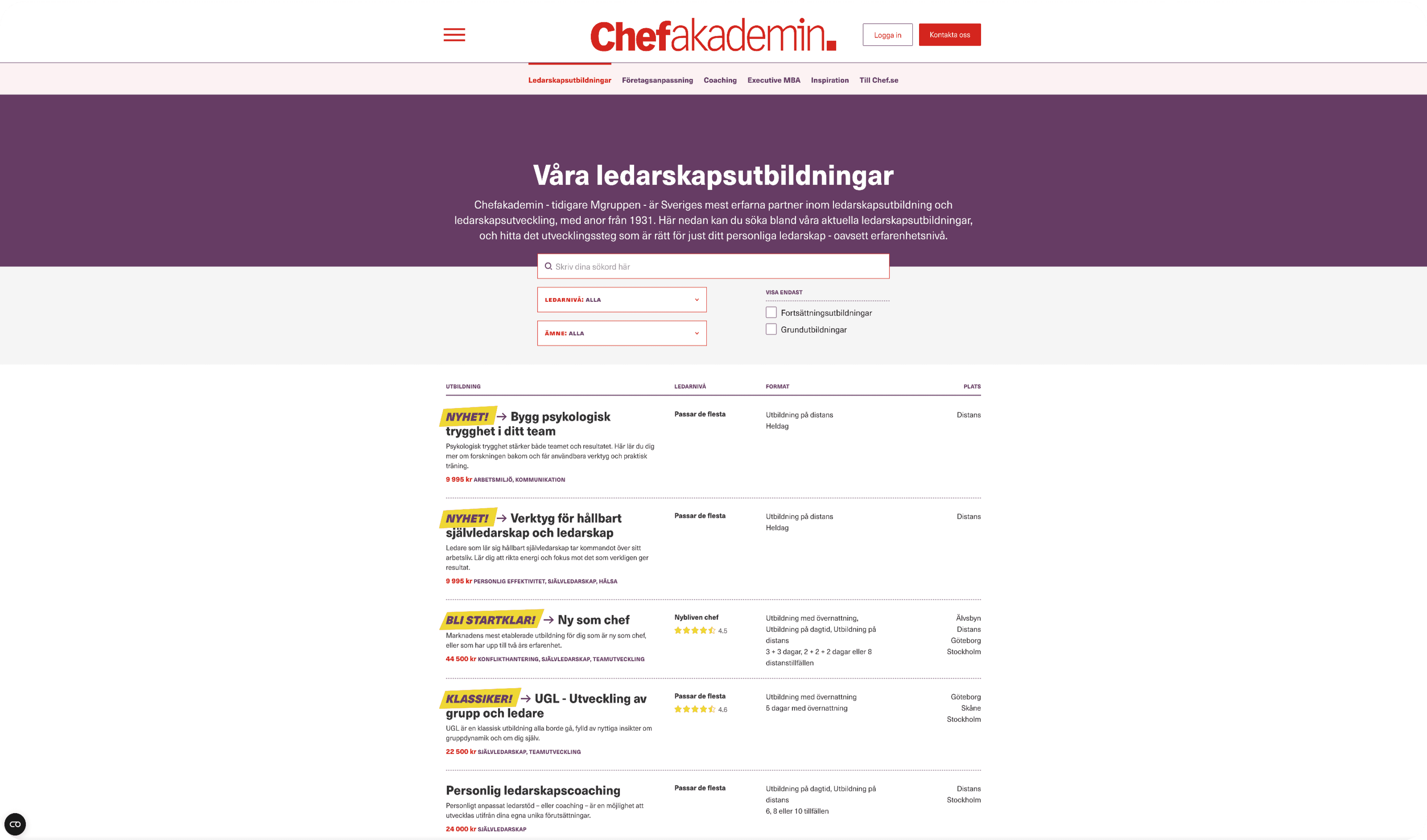
All sorts of listings
I designed a comprehensive listing page to consolidate and organize all the knowledge and materials. To ensure consistency, I developed a base structure for the lists and implemented tailored filters for different content types. This approach streamlined the process of finding relevant information.


Broad and playful visual language
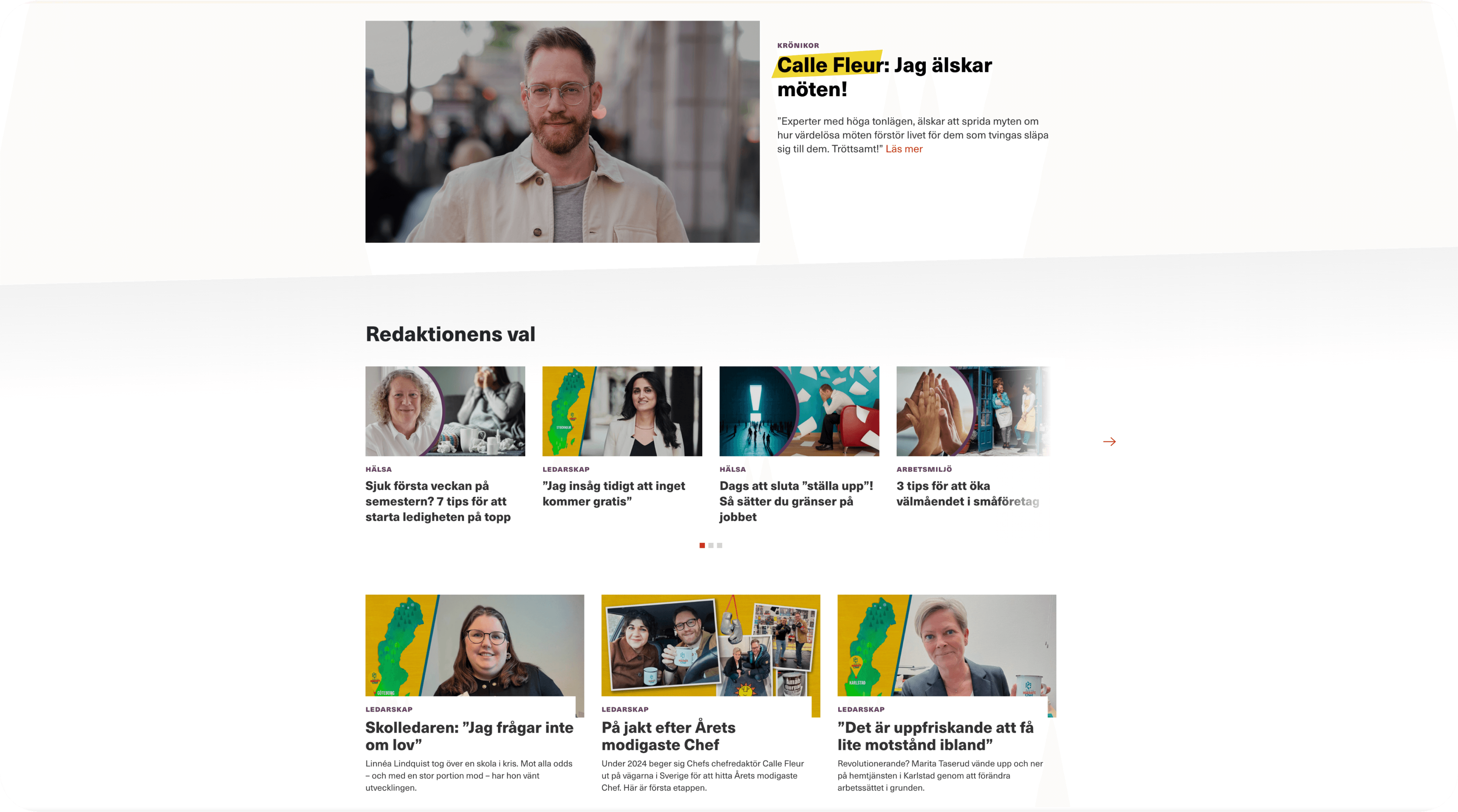
In this project, we focused on utilizing a broad color palette and incorporating playful shapes and overlapping layers. This approach was key to avoiding a stiff, stereotypical look for a magazine aimed at managers. Instead, it allowed us to deliver a dynamic and engaging visual experience.
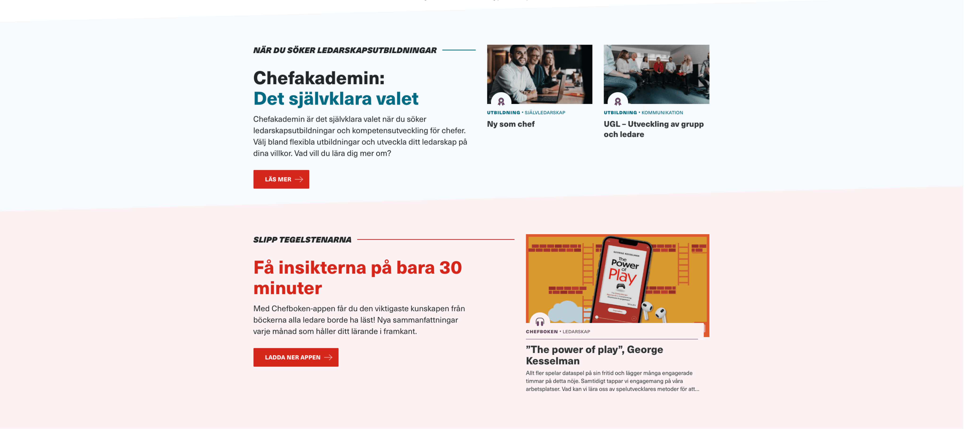


This section divider is designed at a slight angle to symbolize forward progress and upward development.
This section divider is designed at a slight angle to symbolize forward progress and upward development.
This section divider is designed at a slight angle to symbolize forward progress and upward development.
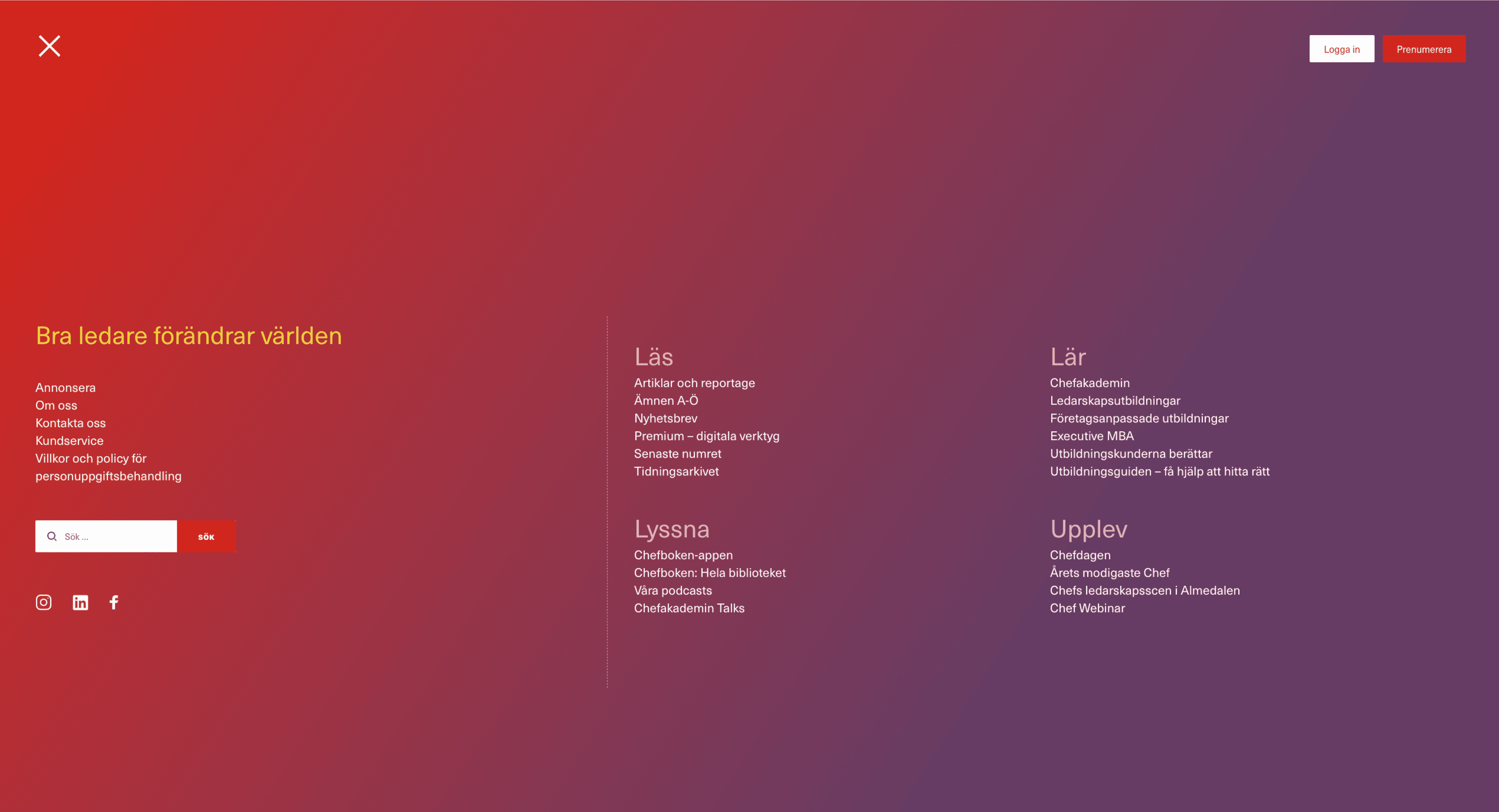


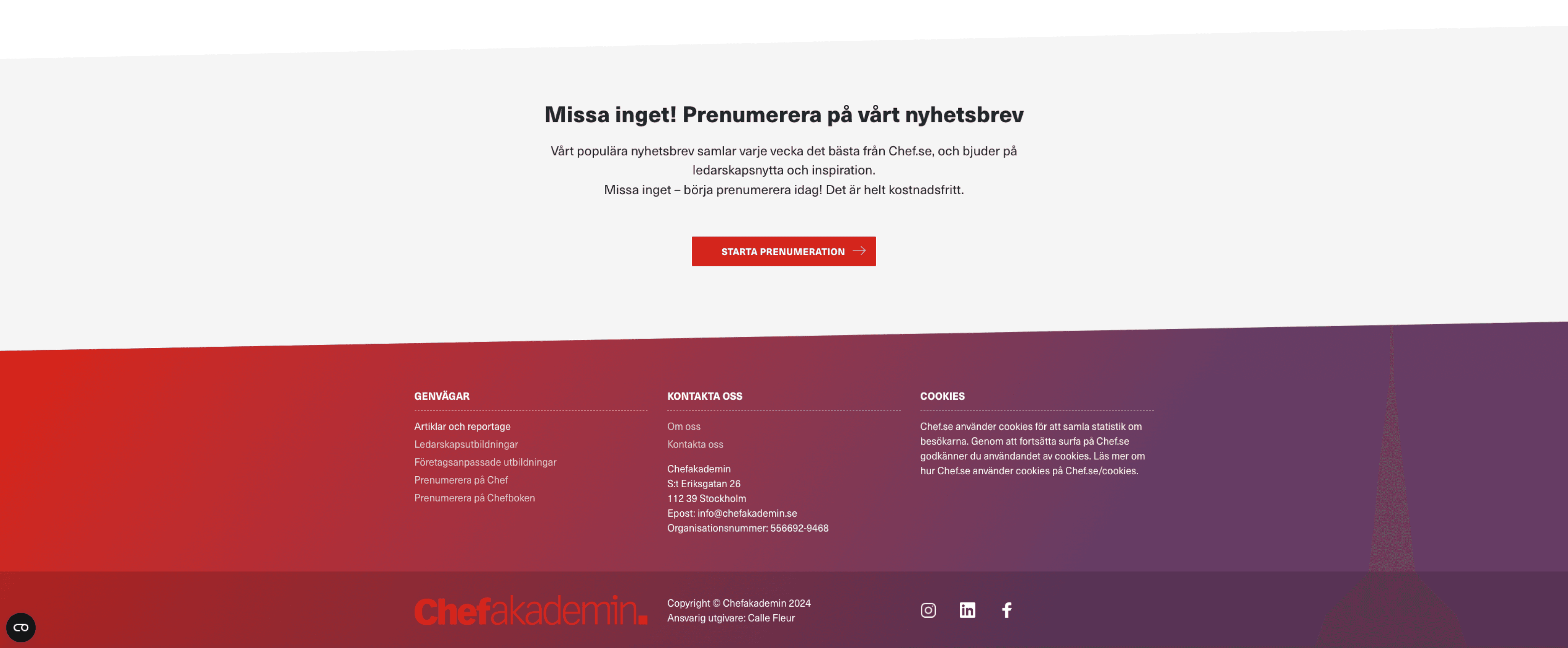
With the footer and navigation, I aimed to embrace the merging process while building trust in the new and improved combination of the three companies.
With the footer and navigation, I aimed to embrace the merging process while building trust in the new and improved combination of the three companies.
With the footer and navigation, I aimed to embrace the merging process while building trust in the new and improved combination of the three companies.


Custom made
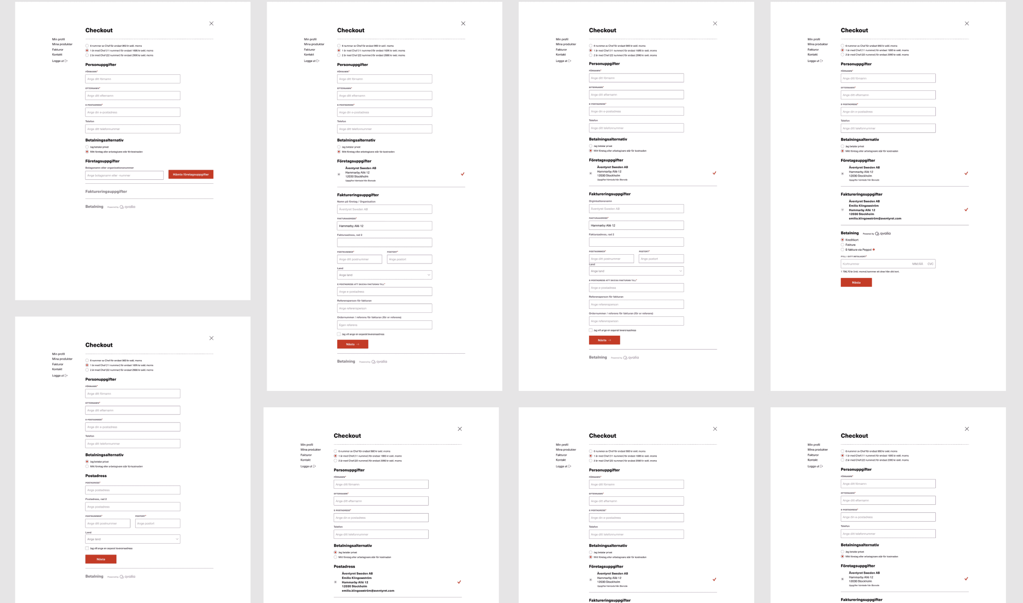
In collaboration with Qvalia, we developed a custom checkout solution for subscribers. This new system simplified invoice management and provided users with greater flexibility for making adjustments to their profiles.
Custom made
In collaboration with Qvalia, we developed a custom checkout solution for subscribers. This new system simplified invoice management and provided users with greater flexibility for making adjustments to their profiles.
Custom made
In collaboration with Qvalia, we developed a custom checkout solution for subscribers. This new system simplified invoice management and provided users with greater flexibility for making adjustments to their profiles.
