Background
Extrakt is an online magazine owned by the research council Formas. It’s aimed at those who want to stay updated on the research front, but of course, the magazine can be read by anyone interested in sustainability issues. The initial brief was to change the colours and fonts on the current site, but since Formas is a public actor, the new rules about accessibility demanded the project to take a wider perspective.
My role
Design Lead
Accessible colours
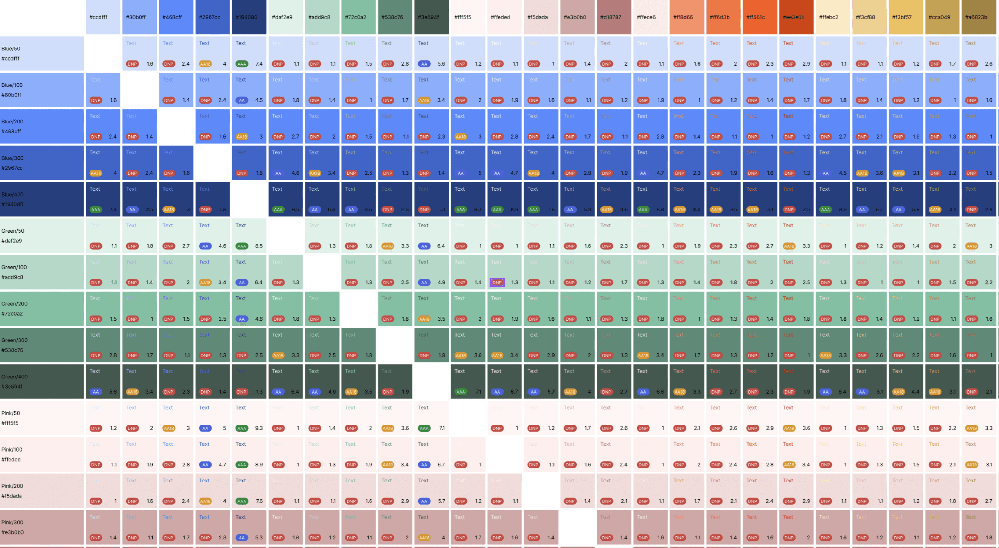
Before starting this project, I reviewed the new visual identity. While testing the contrast ratio of the colors, I realized that most of them did not meet the recommended standards. After several discussions with the client, we agreed to take a deeper look into the site's overall accessibility.


Started with the grid now we’re here
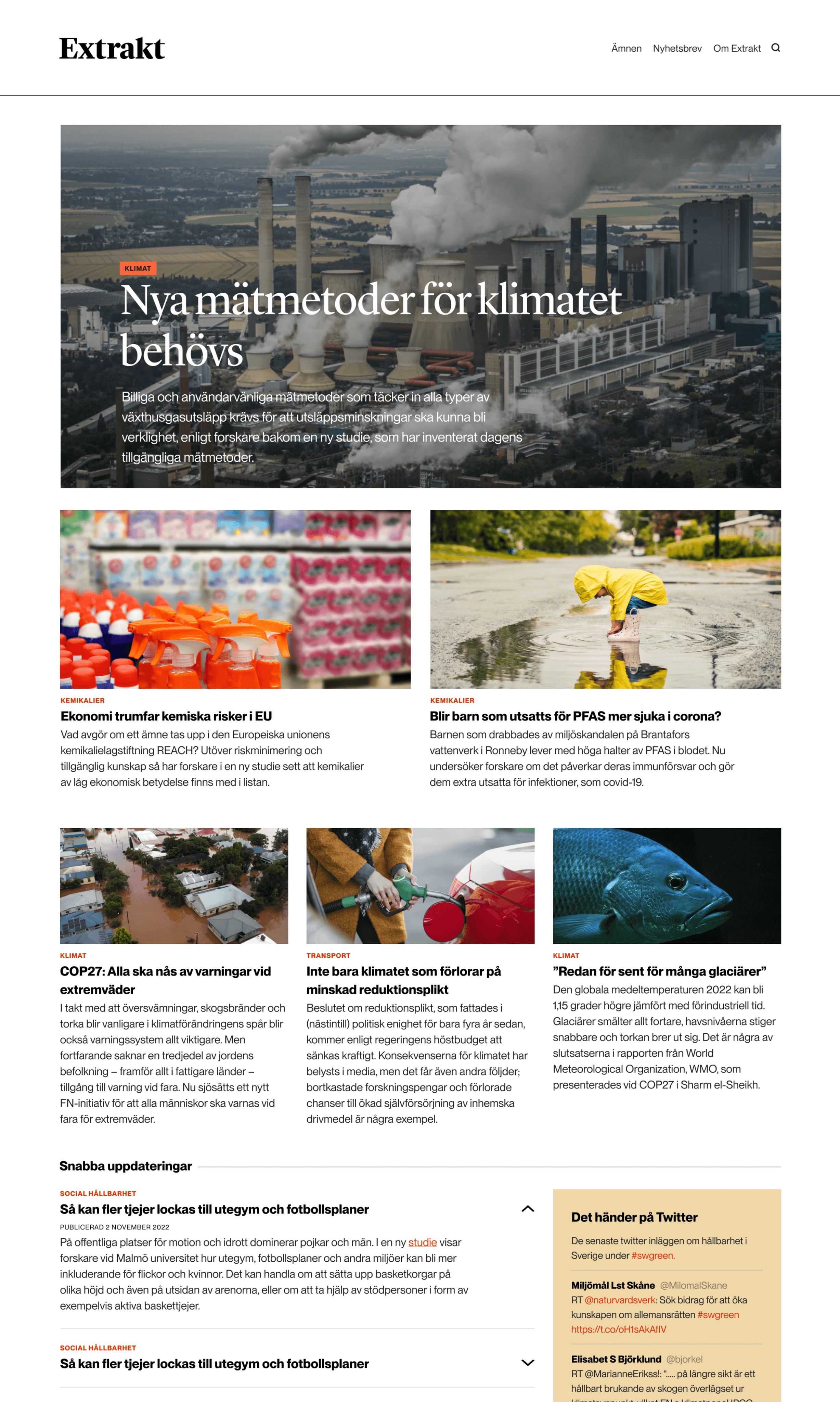
I aimed to build a sense of trust and clarity when structuring the site, steering clear of the clutter often found on magazine websites today. My top priority was to design a grid that was clean and compact, while still giving users a clear view of the content.
Started with the grid now we’re here
I aimed to build a sense of trust and clarity when structuring the site, steering clear of the clutter often found on magazine websites today. My top priority was to design a grid that was clean and compact, while still giving users a clear view of the content.
Started with the grid now we’re here
I aimed to build a sense of trust and clarity when structuring the site, steering clear of the clutter often found on magazine websites today. My top priority was to design a grid that was clean and compact, while still giving users a clear view of the content.


Change the subject, please
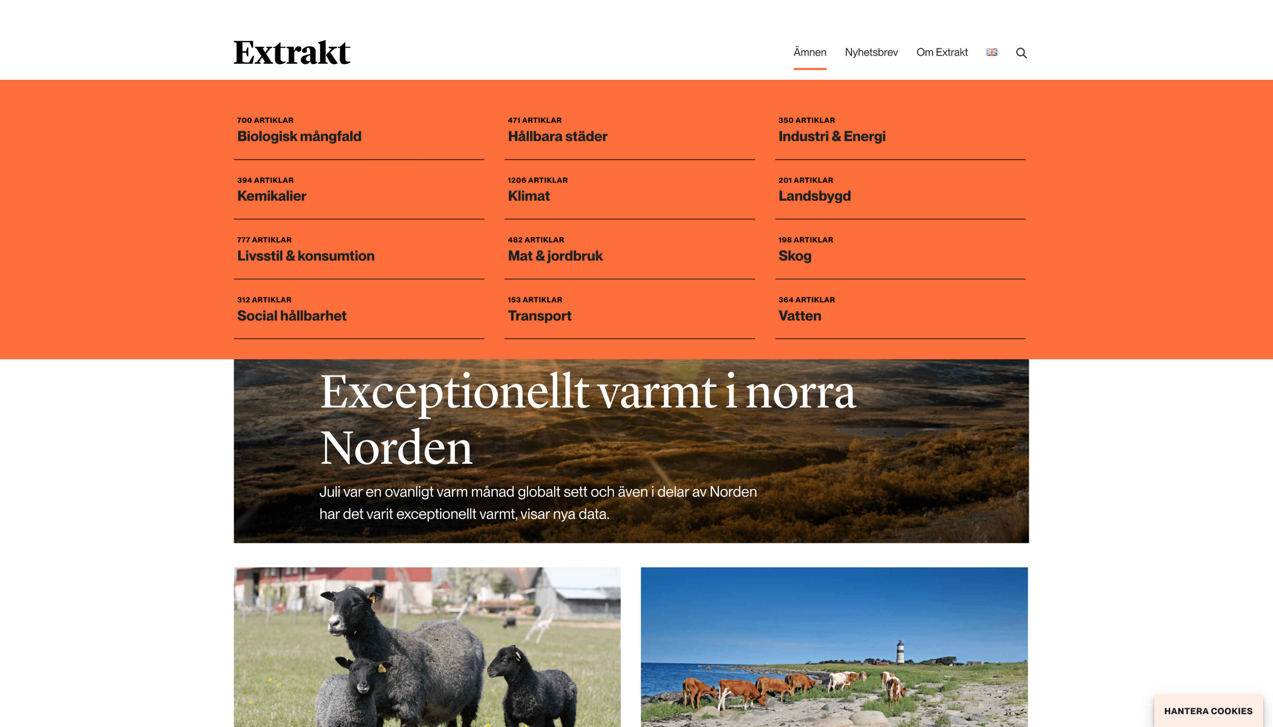
One key insight from our analytics was that users often explored multiple subjects in a single session—they weren't just focused on one topic. This highlighted the importance of having an easy-to-access subject menu. Since I chose not to make the navbar sticky, it felt natural to conclude each page with the option to engage with the subject selector.


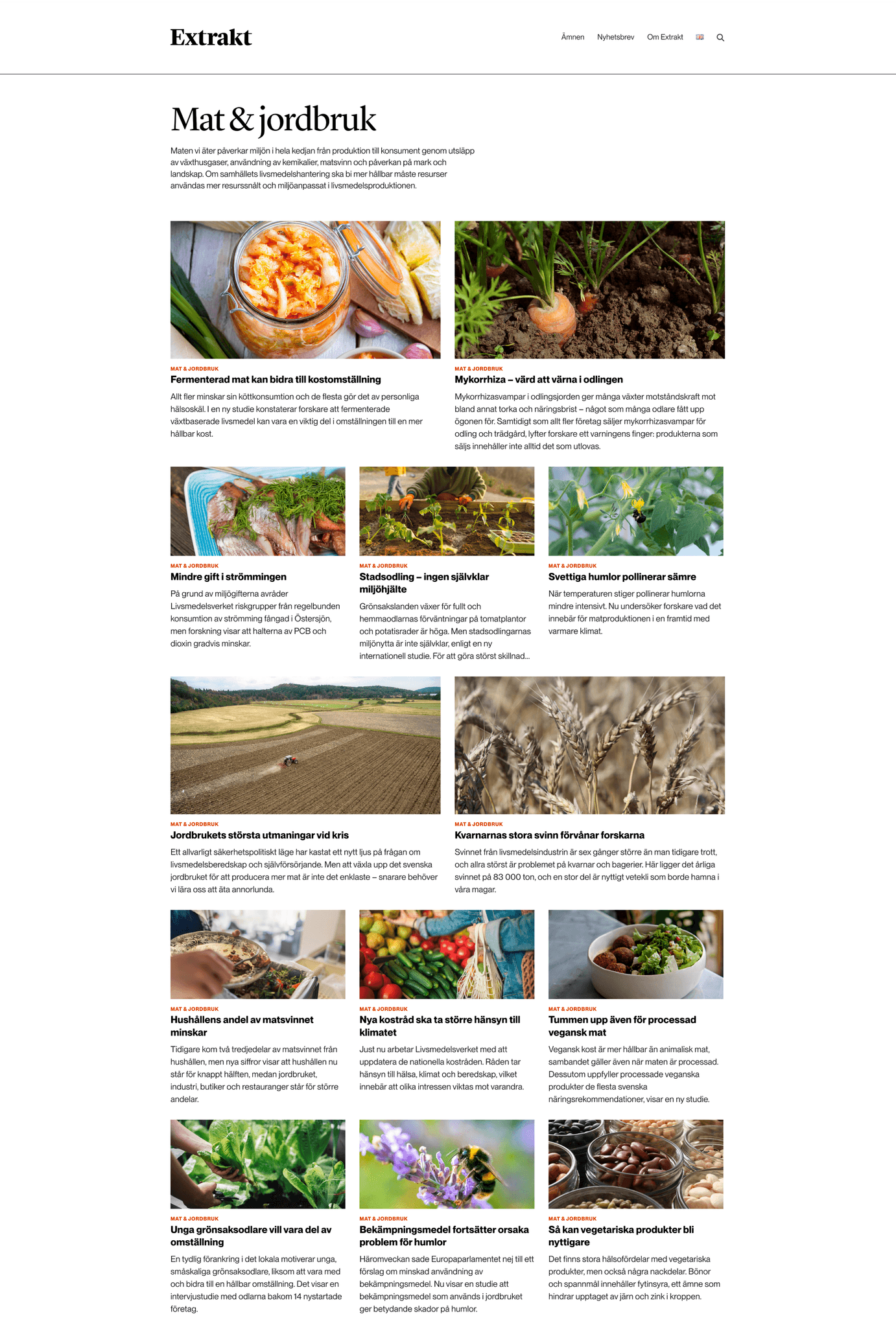
The actual subject page, got a small description followed by a list of articles in a endless scroll. If the time would have allowed it I would had prefered some sort of pagination to easily manage the amount of articles.
The actual subject page, got a small description followed by a list of articles in a endless scroll. If the time would have allowed it I would had prefered some sort of pagination to easily manage the amount of articles.
The actual subject page, got a small description followed by a list of articles in a endless scroll. If the time would have allowed it I would had prefered some sort of pagination to easily manage the amount of articles.


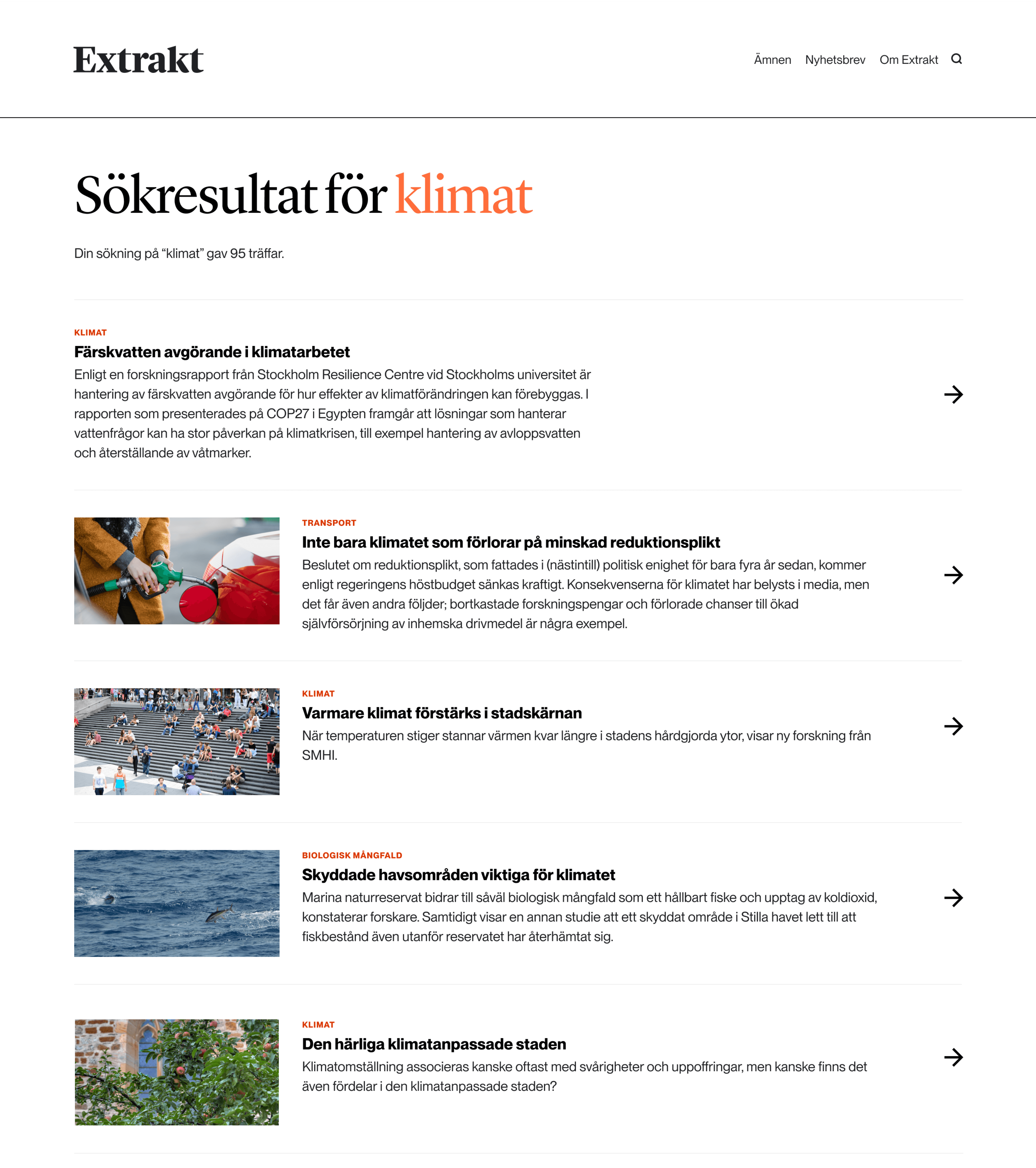
For the search results page, I opted for a different structure than the other listing pages. It was important to prioritise results based on their relevance to the search term to ensure that users could quickly and easily find the most pertinent information. This approach enhances the user experience by providing more targeted and efficient results.
For the search results page, I opted for a different structure than the other listing pages. It was important to prioritise results based on their relevance to the search term to ensure that users could quickly and easily find the most pertinent information. This approach enhances the user experience by providing more targeted and efficient results.
For the search results page, I opted for a different structure than the other listing pages. It was important to prioritise results based on their relevance to the search term to ensure that users could quickly and easily find the most pertinent information. This approach enhances the user experience by providing more targeted and efficient results.


The articles
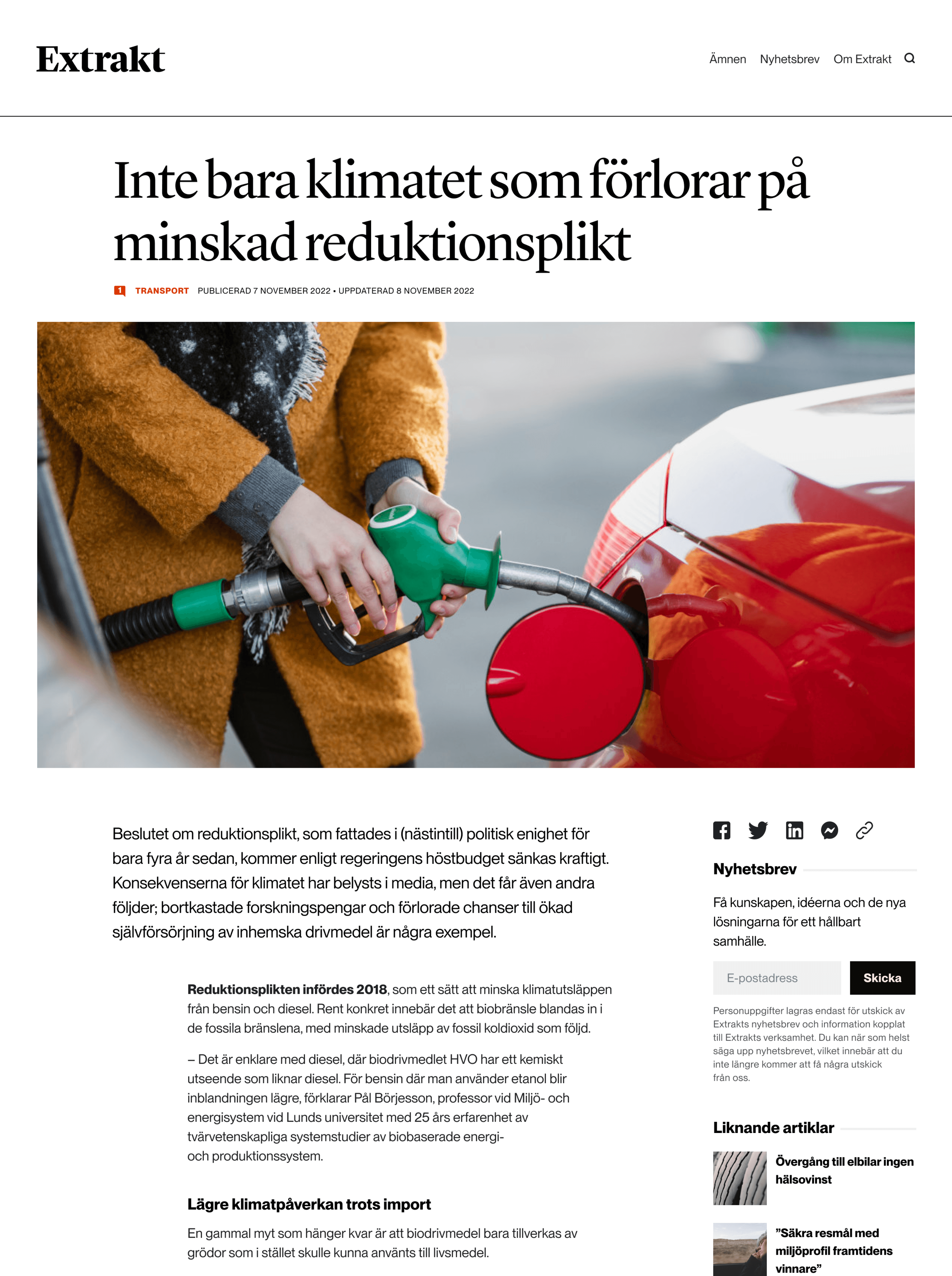
For the articles, I drew inspiration from Swiss-style typography. I aimed for a clean, minimalistic look that emphasised the content. Additionally, I wanted to introduce some movement to guide the reader through the text, creating a sense of flow without making it feel too "jumpy."
The articles
For the articles, I drew inspiration from Swiss-style typography. I aimed for a clean, minimalistic look that emphasised the content. Additionally, I wanted to introduce some movement to guide the reader through the text, creating a sense of flow without making it feel too "jumpy."
The articles
For the articles, I drew inspiration from Swiss-style typography. I aimed for a clean, minimalistic look that emphasised the content. Additionally, I wanted to introduce some movement to guide the reader through the text, creating a sense of flow without making it feel too "jumpy."
