Background
Mölnlycke Health Care, a global leader in medical solutions and healthcare products, embarked on a strategic redesign of its corporate website. The primary goals were to enhance user experience, modernize the brand's digital presence, and support the company's mission to improve patient outcomes by providing high-quality medical products and services.
My role
UX/UI Designer - Mainly focused on the visuals while ensuring the user experience and site interactions remain in focus. Additionally, responsible for aligning with the appropriate accessibility standards.
Contact us
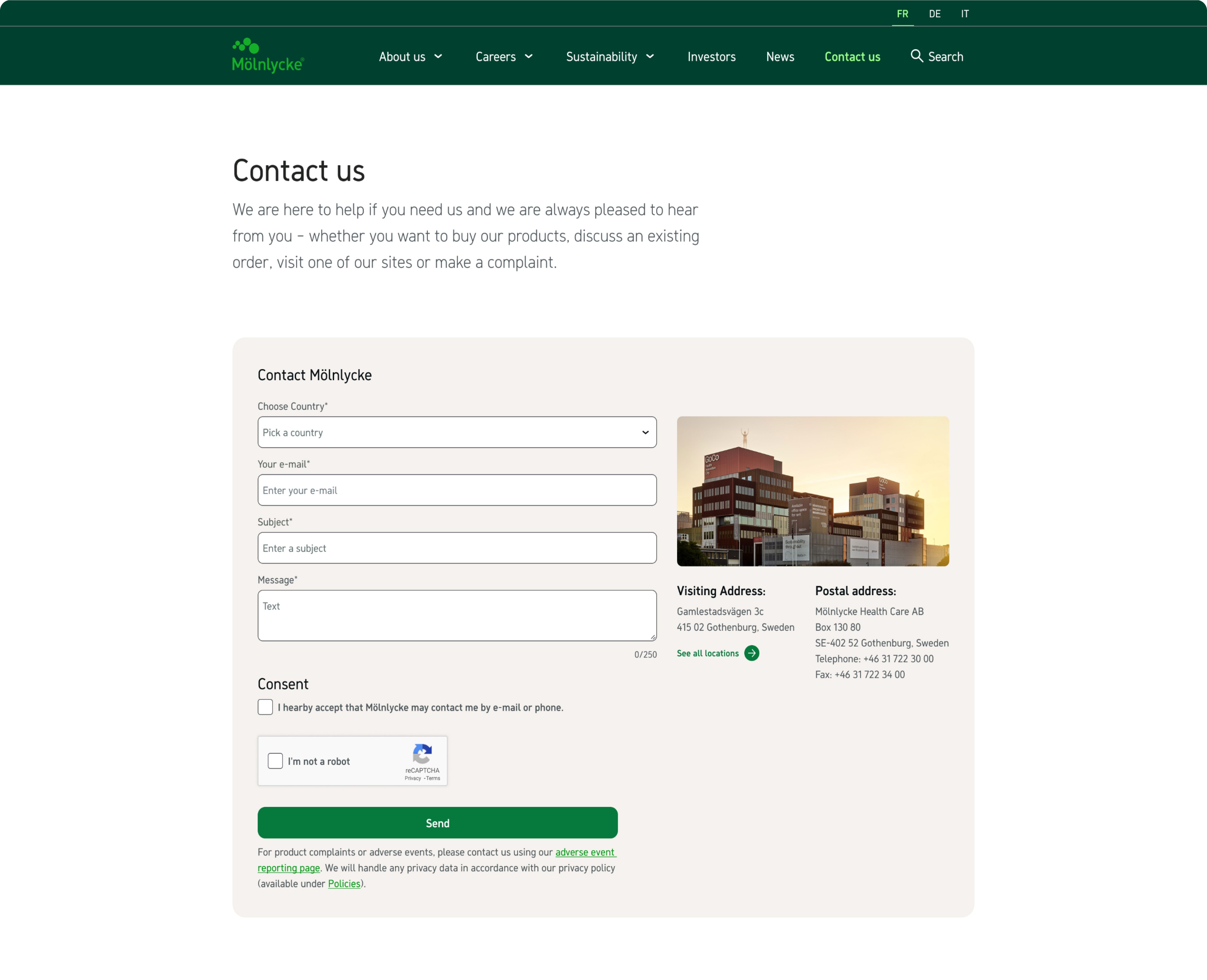
With the redesigned contact page, I aimed to create a more intuitive and engaging structure for its information. The previous "Contact Us" page began with a long list of all Mölnlycke's locations followed by the contact form. By prioritizing ease of use and visual clarity, the new design facilitates smoother interactions, leading to higher user satisfaction and improved engagement.


Locations locations locations
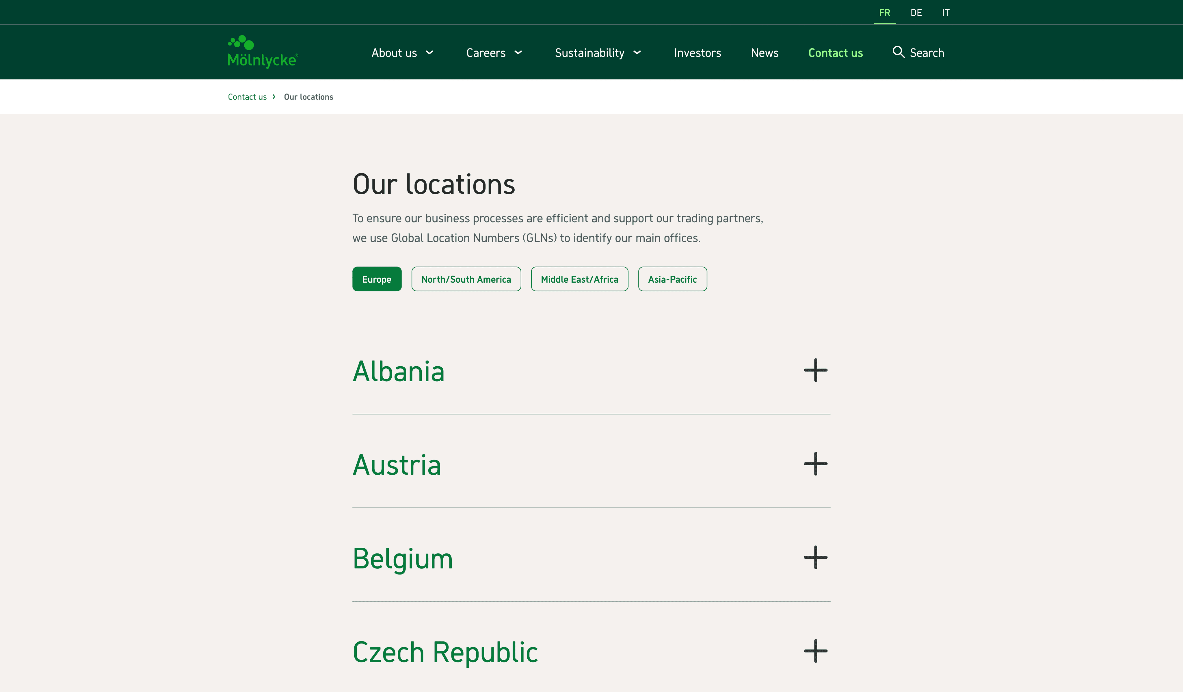
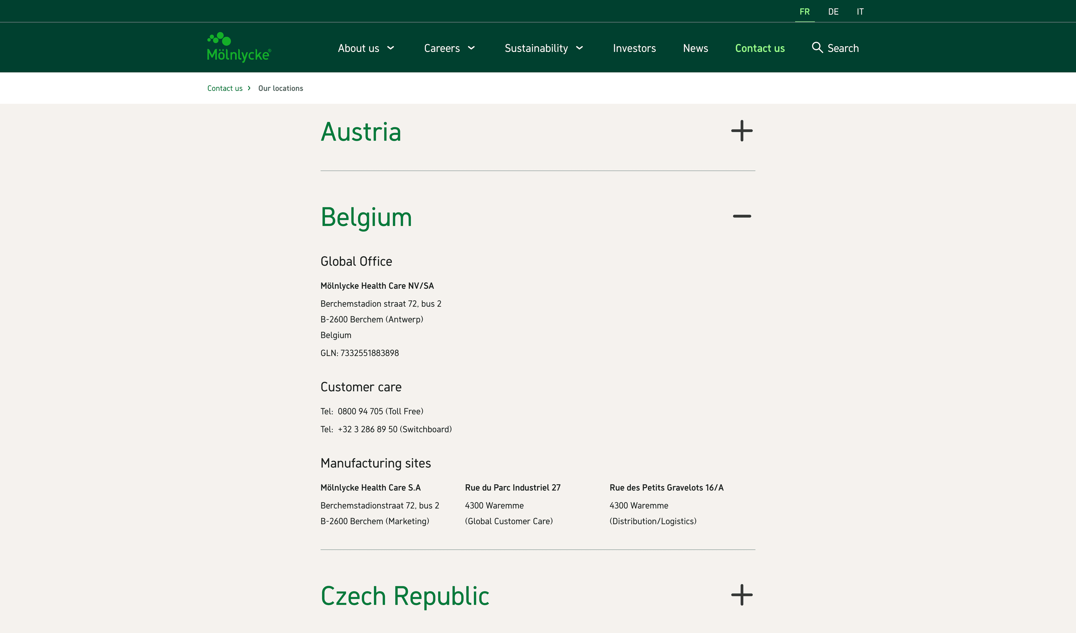
As mentioned above, the locations took up a lot of space, detracting from the primary interaction of contacting Mölnlycke. To address this, we decided to create a separate page solely for the locations. This decision enhanced the overall experience for both pages. On the Locations page, we categorized the countries by continent, making the list far less overwhelming. Additionally, we used an accordion for each country, allowing us to present all relevant information in one place.
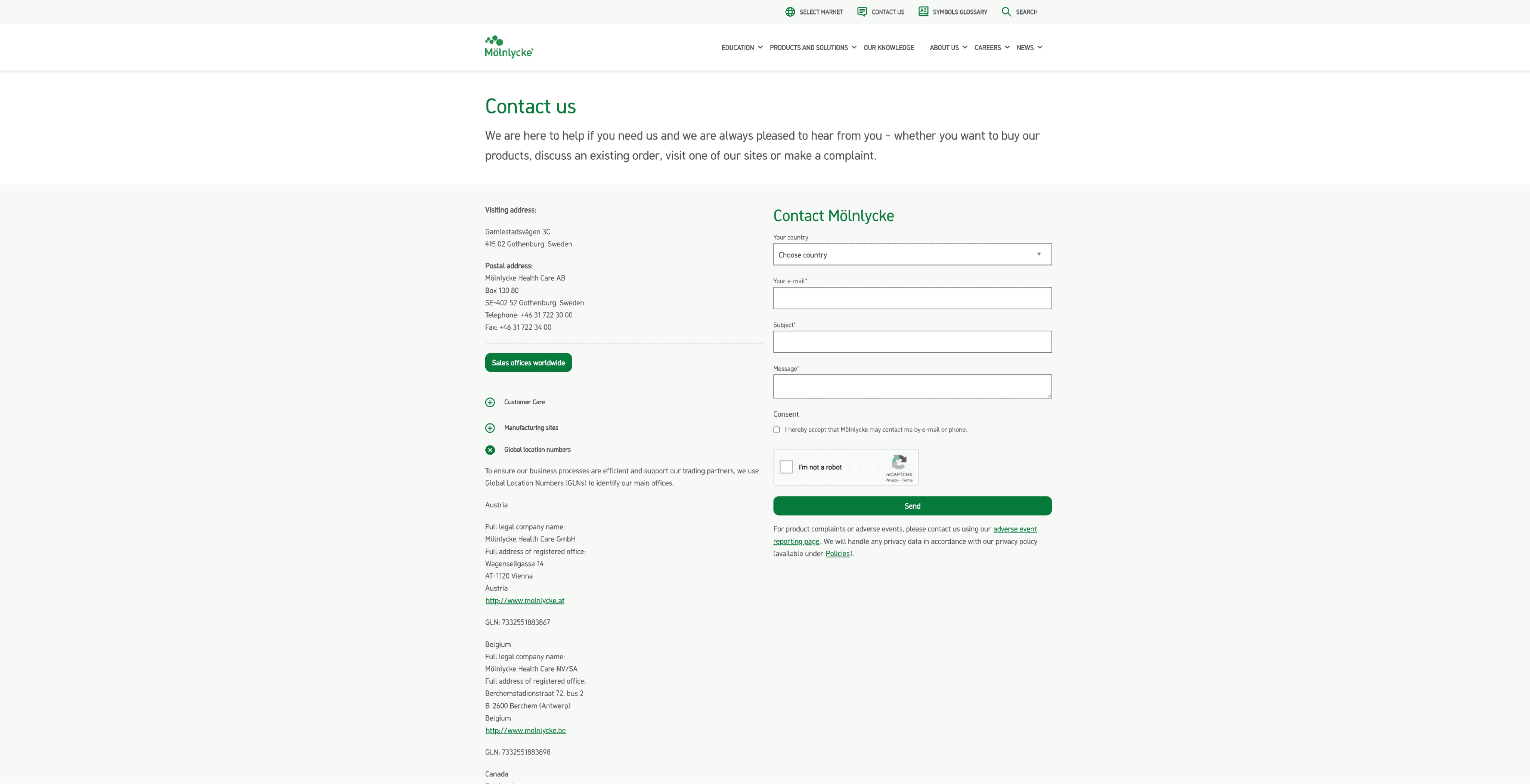
Contact us page before redesign, the left column is where we find the locations. And on mobile view it stacked to the top.


Contact us page before redesign, the left column is where we find the locations. And on mobile view it stacked to the top.


Contact us page before redesign, the left column is where we find the locations. And on mobile view it stacked to the top.


Contact us page before redesign, the left column is where we find the locations. And on mobile view it stacked to the top.


Contact us page before redesign, the left column is where we find the locations. And on mobile view it stacked to the top.


Contact us page before redesign, the left column is where we find the locations. And on mobile view it stacked to the top.


Contact us page before redesign, the left column is where we find the locations. And on mobile view it stacked to the top.


Contact us page before redesign, the left column is where we find the locations. And on mobile view it stacked to the top.
Articles
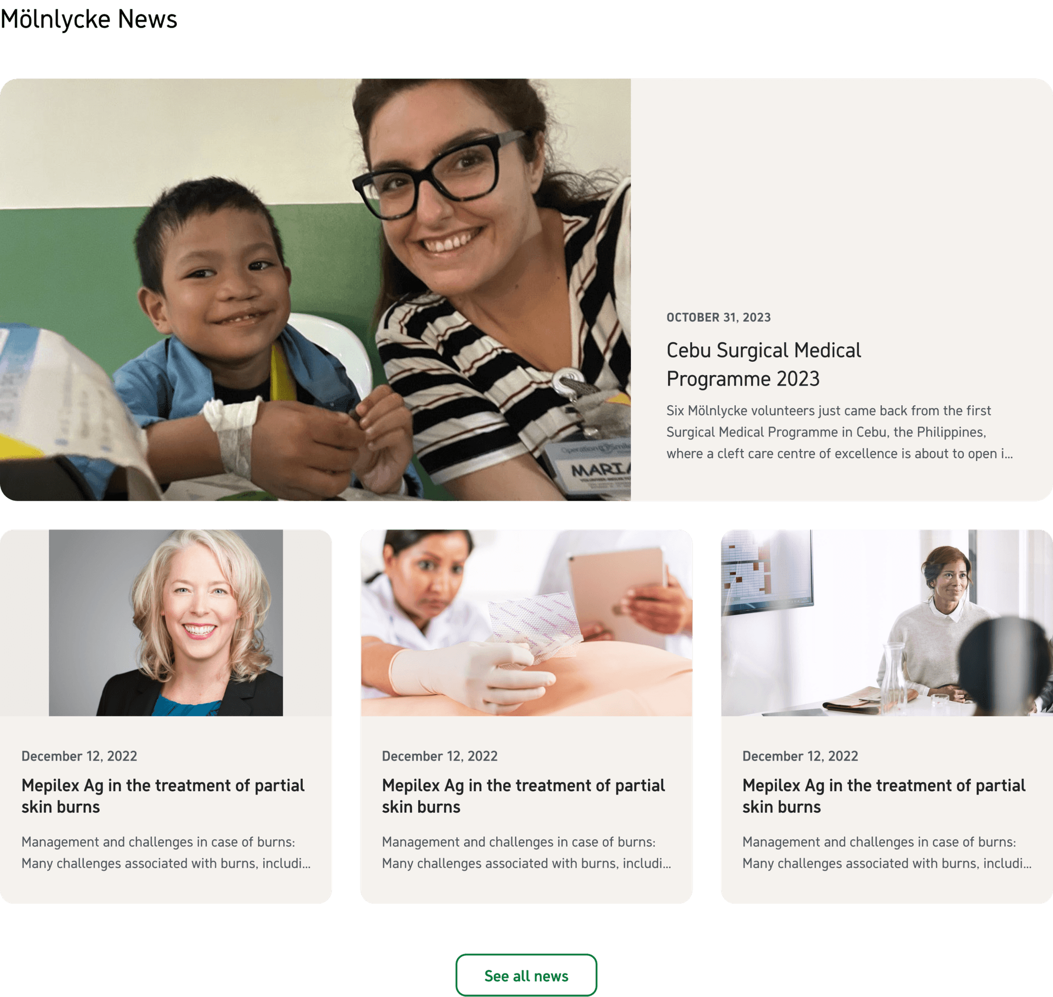
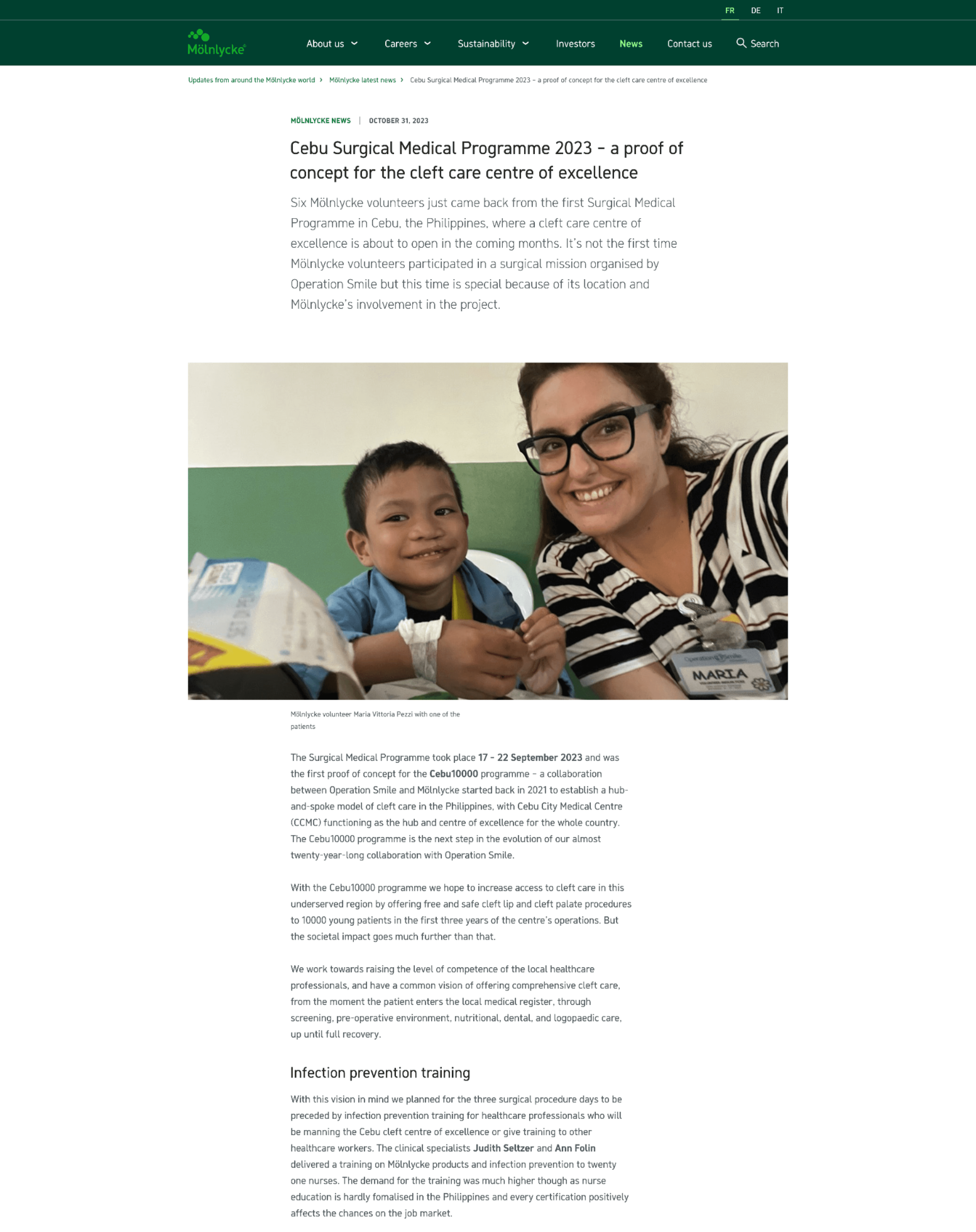
The old articles in Mölnlycke's news section were all written and edited in a single rich text editor. This made it difficult for readers to distinguish and organize information and key sections of interest. I developed a more fluid and structured approach for the editors to present information, making it clearer and easier to read. This new method highlights the most important points as intended by the author.


Listing pages
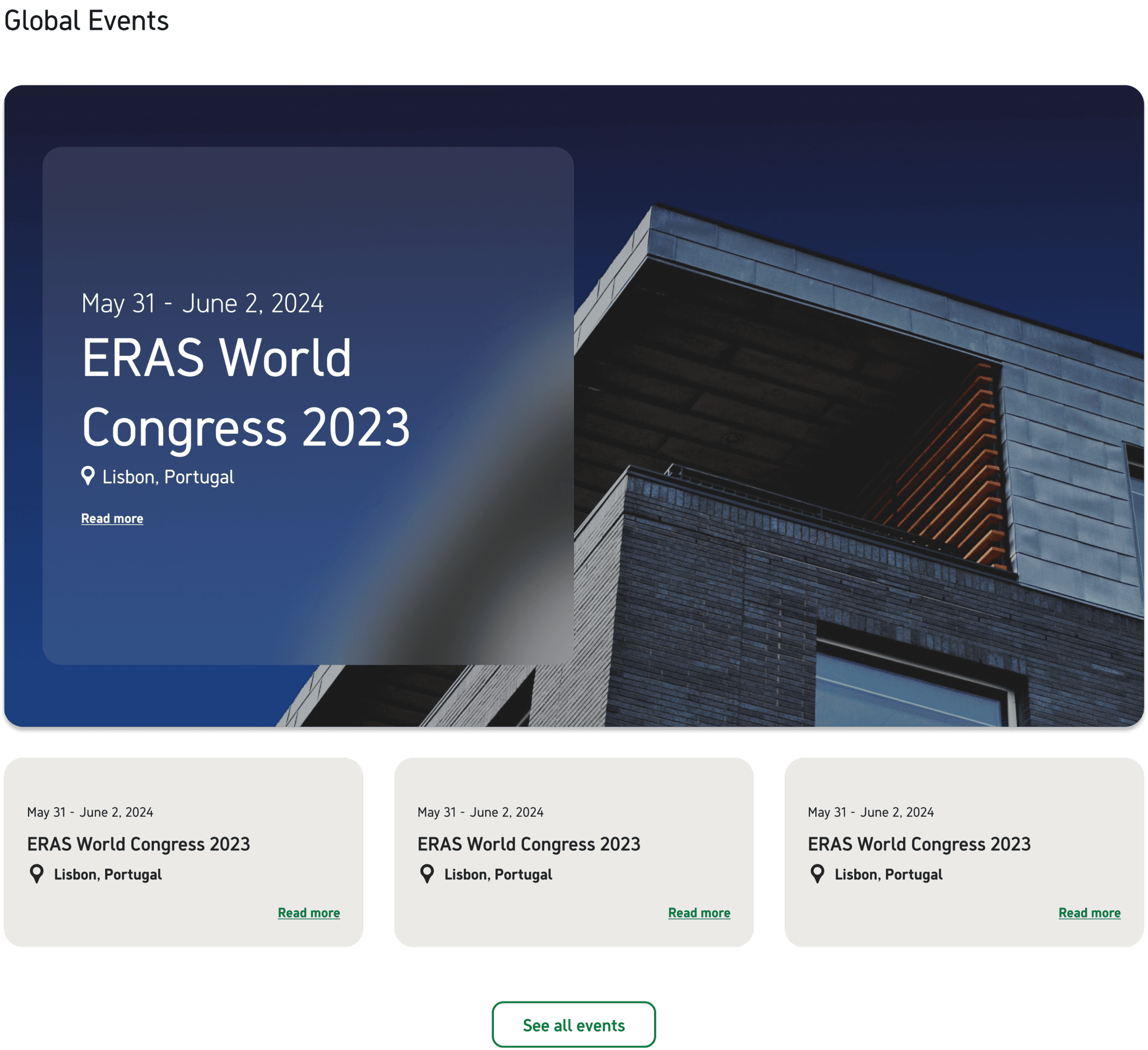
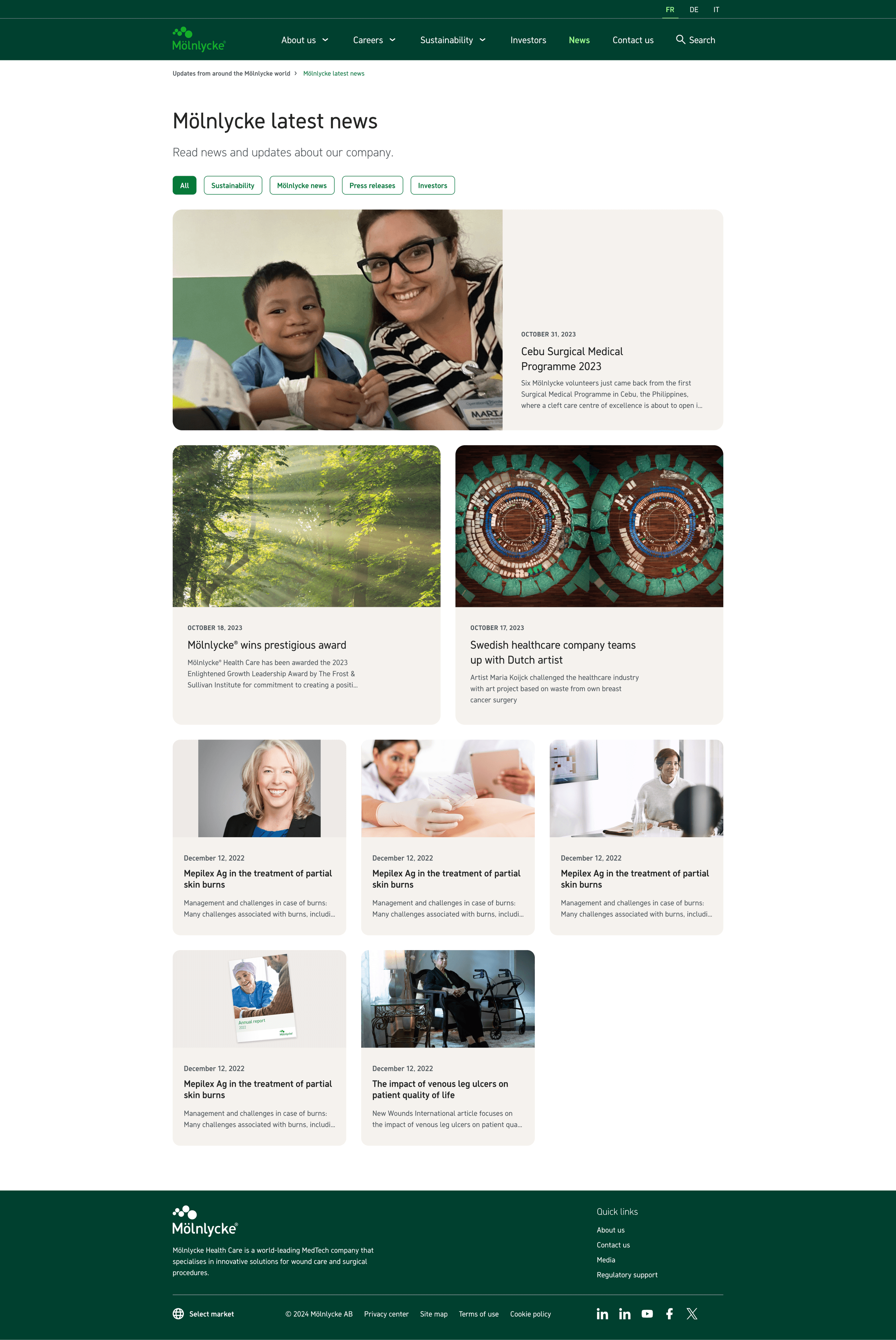
With the new listing page, I aimed to ensure users could easily find the information or reading material they were looking for. Previously, it could be confusing to discern the type of media being accessed. To address this, I categorized each type of content into its own section. Within each section, items open on their own page and function as a filtered list, enhancing clarity and usability.
